sound

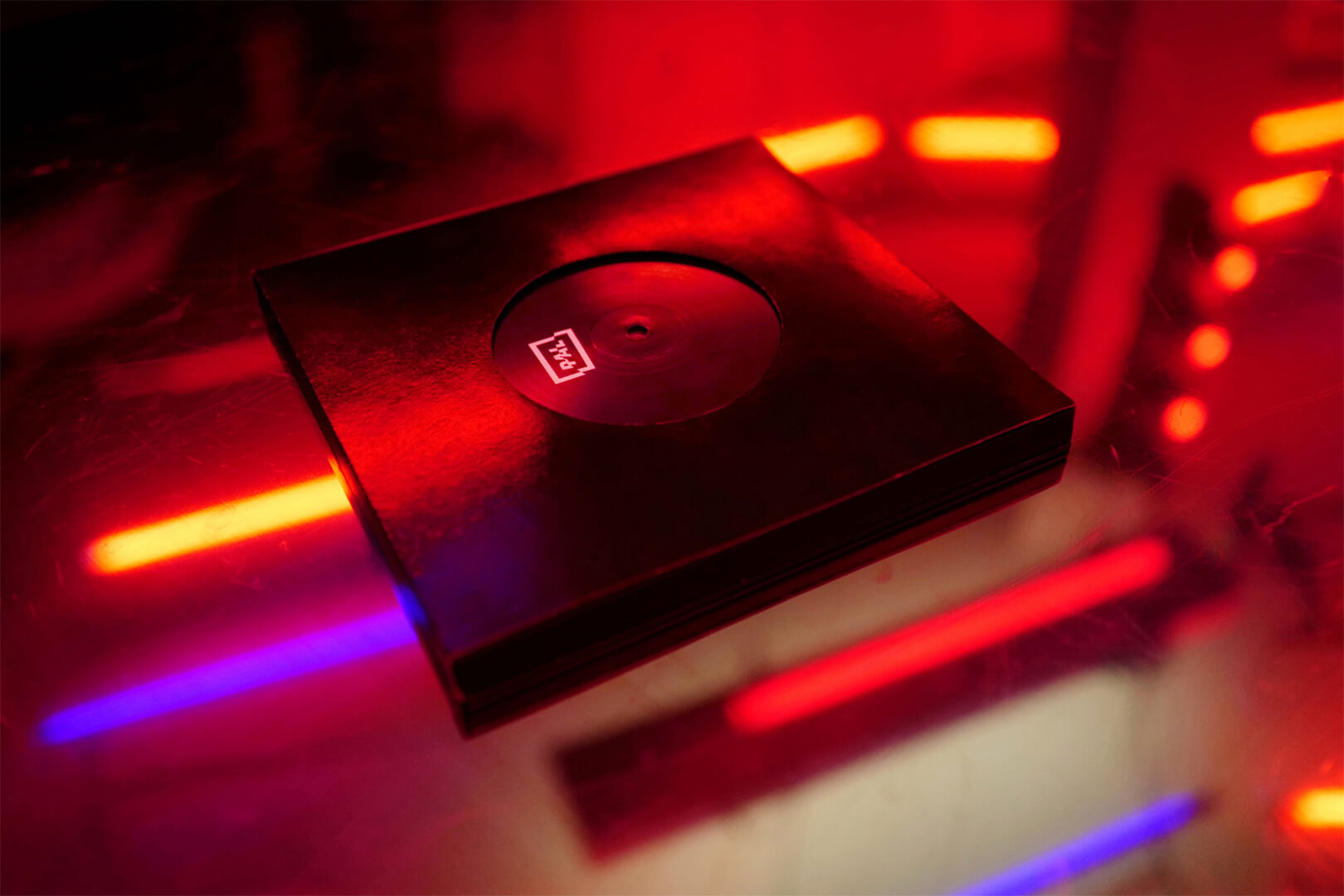
The Vinyl Book – Branding, Editorial, Curation, Motion (2019)

The vinyl is transferred to corporate identity of the book which documents the visual works and images of the Hamburg based techno club PAL as a catalog that you can play on your turntable. PAL is an abbreviation for Phase Alternating Line - a transmission technology used in analog television. The layout system is derived from typical television distortions and the different record sizes. With the pagination it transmits the teletext model.
The project was made for Mutabor including photos by Markus Wendler, graphics by Maison Blessing and the soundtrack by Leo Faerber. iF Gold Award Communication (2020) / Red Dot Award Publishing & Print Media (2019) / Epica Awards Bronze Brand Identity (2019) /Cannes Lion Brand Building (2019) / Corporate Design Preis CD Launch (2019) / ADC Europe three times silver / ADC - silver in each category Corporate Identity & Visual Identity, Promotional Packaging & Collateral (2019)

more

Alles Elbe – Web Design (2018)

Web design for Alles Elbe. Tasty home-brewed and handmade beers from Germany & Czech Republic. Some pretty good sausage. Delicious dinner bread and the wine can be surprisingly good. Everything they offer comes from the Elbe and it`s tributaries between Cuxhaven and Prague.

more

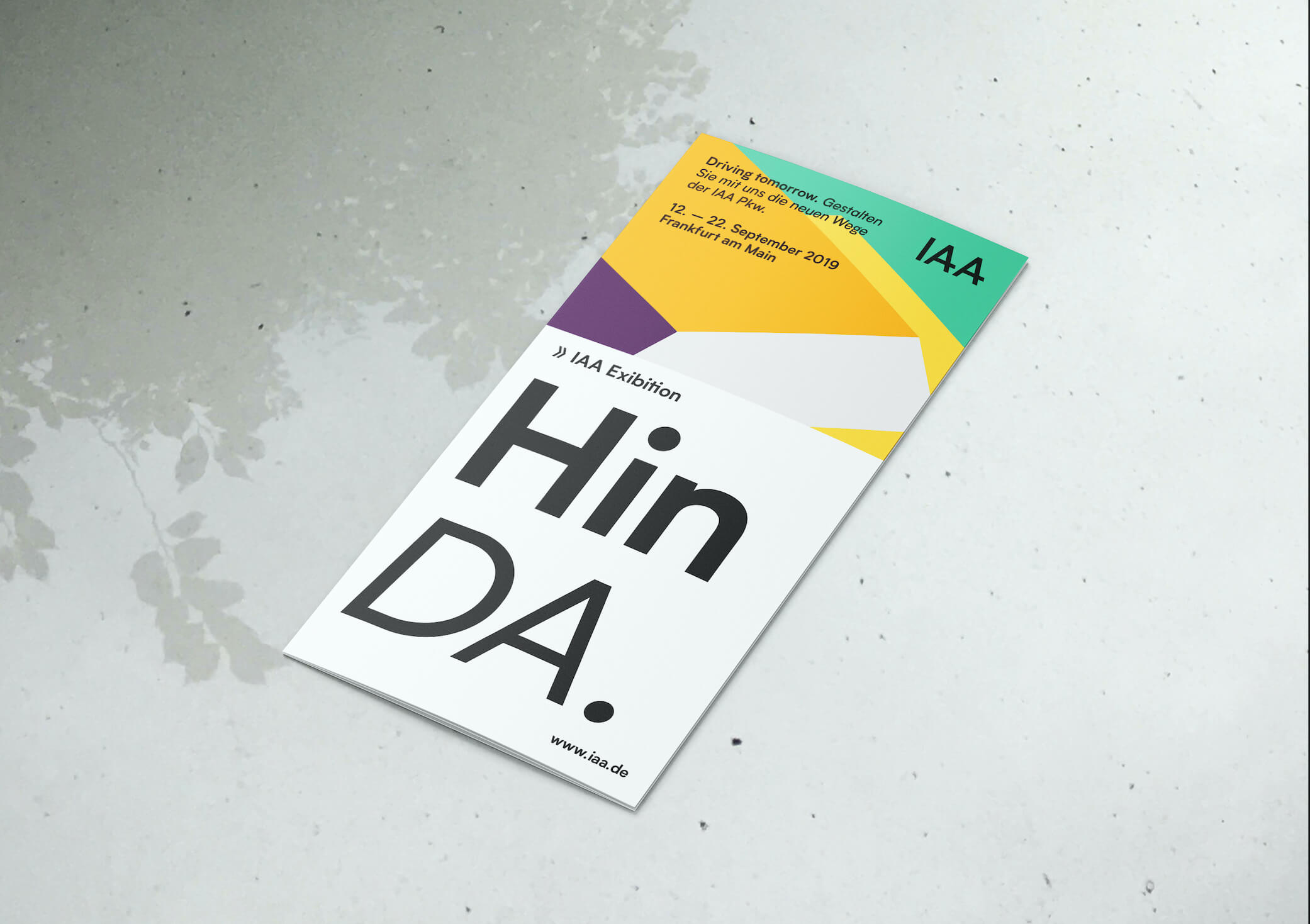
IAA – Booklet (2018)

Booklet for the realignment of the IAA 2019. I tried my very best to modernise the corporate design. Designed at Mutabor.

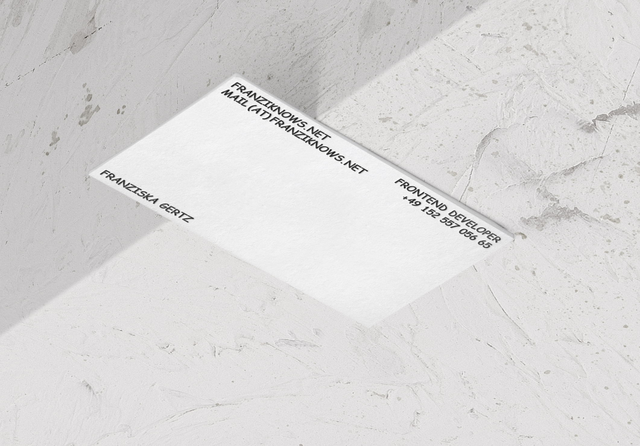
franzisknows.net – Branding (2018)

The only person Comic Sans suits to. Corporate Design for Frontend Developer franziknows.net.

Alles Elbe – Branding, Poster (2018)

Corporate Design for Alles Elbe. Tasty home-brewed and handmade beers from Germany & Czech Republic. Some pretty good sausage. Delicious dinner bread and the wine can be surprisingly good. Everything they offer comes from the Elbe and it`s tributaries between Cuxhaven and Prague.

more
sound

Gestalten im geschlossenen System – Editorial, Curation (2017)

This book provides insights to the theme design in the closed system. Exemplified by the work of 3 selected artists: Helmut Brade, Karl-Heinz Drescher and Lothar Reher. It shows the possibilities and limitations of graphic design in the GDR from 1969 to 1989. The result is a compendium of found images, texts and interviews. DDC - shortlist (2017) / German Design Award - Nominee (2017)

more

Lorraine – Packaging, Branding, CD & Vinyl (2017)

Album artwork for Lorraine. CD and DVD in a customised slipcase. The single pieces allow a modular cover. Photos by Bjoern Lexius.

Resource Architecture – Editorial (2015)

The book deals with architectural solutions that recognize building stock as a valuable resource. Valuing the existing is the best starting point for a completely open-minded approach: appreciating that the dilapidated, the strange and the ordinary are architectural resources worth taking seriously can lead to potential new directions in architecture. This book presents projects and perspectives by architects who chose a positive, empowering view of existing structures as an inspiration and motivation for further development. Identities settled somewhere between new and old.

more

Gutschow – Typeface (2015)

A geometric sans serif typeface based on Futura, with fine and thick strokes to create a subtle association to the Bauhaus aesthetics. The structure refers to the dynamic orientation of the 1920th movement Neues Sehen (New Vision) photography. Arvid Gutschow, a German photographer, is considered a representative of the New Objectivity.

more

Stilvorlagen – Branding, Editorial, Poster, Web Design (2014)

Development of the corporate design for Stilvorlagen. This lecture series critically examines positions in communication design within a societal context and was held at the Design Department of the HAW Hamburg. Documentation in regards to the character-shaping of a series of lectures on the topic of design and society. It was examined which identity would be forward-proof in regards to a lecture series on "Stilvorlagen“. Furthermore was elaborated how the contents could be communicated in a mission conscious manner beyond the borders of Hamburg. In the discourse of project management, contemporary curatorial practice and media communication, conventional strategies and design concepts were questioned and newly implemented.

more
sound

Echolot Limbo ihr Fotzen – Editorial (2012)

This book aims to communicate and visualize the Tourette Syndrome. It deliberately impedes the readability, as both the text as well as the Tourette break through the chosen format with their own lives. Fragments detach from one another in order to create new relations. ADC - junior competition (2012)

more

Dunkhase – Branding, Web Design (2016)

Corporate design for business coach and personal trainer Jens Gunnar Dunkhase.

Lorraine – Branding, Vinyl & CD (2015)

Design for vinyl sleeve & cd for the released album Lorraine.

Frau Gans und der Clown – Editorial, Curation, Photography (2011)

A picture book about a lonely woman in need of care and her caregiver who part time acts as an hospital clown. The focus lies on the transformation from the normal guy to the colourful clown and the difficulties of work-life-balance. Pictures taken by me.

more

Helvetica – Editorial, Curation (2011)

This book pays tribute to Helvetica, the entertaining shift worker among typefaces, to its forgotten creator Max Miedinger and to all those who have contributed to its unrivalled international success.